
Responsive web design has evolved from a cutting-edge technique to an absolute necessity in modern web development. With over 60% of website traffic now originating from mobile devices, a figure that continues to climb, businesses can no longer afford to ignore how their digital presence adapts across screen sizes. The challenge isn’t just about making websites “fit” on smaller screens; it’s about creating seamless, intuitive experiences that feel native to each device, whether users access content on a smartwatch, smartphone, tablet, or desktop monitor. In this climate, knowing successful responsive web design examples will prove worthwhile.
This article moves beyond generic best practices to showcase 25+ real-world responsive web design examples that demonstrate how leading brands solve responsive design challenges. By examining these case studies alongside technical frameworks and strategic approaches, you’ll discover actionable insights that transcend typical design tutorials. Rather than discussing theory alone, these examples reveal the decision-making processes behind successful responsive implementations—the “why” behind specific layout choices, navigation patterns, and content prioritization strategies. For businesses and designers seeking to elevate their digital presence, understanding these proven patterns provides both inspiration and a practical roadmap for implementation.
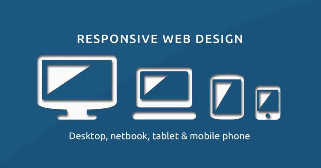
What is Responsive Web Design?
Responsive Web Design is a design methodology that enables websites to automatically adapt their layout, content, and functionality based on the device, screen size, and orientation of the user accessing them.
Instead of creating multiple website versions for different devices (a resource-intensive approach that became obsolete), responsive design uses a single, flexible codebase that intelligently adapts to any screen size or device capability.
At its core, responsive design operates through three foundational principles originally defined by Ethan Marcotte in 2010:
- Flexible grids that scale proportionally using relative units (percentages, em values) rather than fixed pixels
- Flexible images that resize within their containers without distorting or breaking layouts
- Media queries that apply different CSS styles based on device characteristics like viewport width, orientation, or pixel density
Modern responsive design extends these principles with a fourth critical component: responsive typography, which ensures text remains readable and appropriately sized across all devices. This means adjusting not just font sizes but also line-height, letter-spacing, and line-length to optimize readability—particularly important since research shows users prefer larger text on mobile devices than designers initially assume.
Why Responsive Web Design Matters?
The statistics supporting responsive design aren’t merely academic; they directly impact your business metrics. Google’s mobile-first indexing means your website’s mobile version is the primary basis for search rankings. A website that functions beautifully on desktop but delivers a frustrating mobile experience will suffer both in search visibility and conversion rates. Users abandoning slow-loading or poorly-formatted mobile sites represent lost revenue, leads, and customer relationships.
Beyond SEO, responsive design directly influences user behavior. Consistent, well-designed mobile experiences lead to lower bounce rates, longer session durations, and higher conversion rates. The financial advantage is compelling: eliminating the need to develop, maintain, and host multiple website versions reduces development costs by 30-50% compared to creating separate mobile apps or dedicated mobile sites.
Best Practices for Responsive Web Design
- Mobile-First Approach: Start designing at the smallest breakpoint (320px–360px). Add complexity as width increases. This forces clean hierarchy and prevents bloated mobile experiences.
- Touch Targets: Buttons and links need at least 44×44px (Apple and Google standard). Add generous padding. Test with real thumbs, not mouse cursors.
- Prioritize Content Hierarchy: Hide or collapse non-critical elements on mobile. Use progressive disclosure: accordions, “Read more” triggers, tabbed content. Users get what they need fast.
- Fluid Typography: Replace fixed pixel values with clamp(). Example: font-size: clamp(1rem, 2.5vw, 3rem). Text stays readable on every device without media-query spam.
- Scalable Vector Graphics (SVGs): Use SVG for icons, logos, illustrations. They stay crisp at any resolution and remain tiny in file size.
- Performance: Responsive does not mean heavy. Optimize images with WebP/AVIF, lazy-load off-screen content, and serve correct sizes via “srcset”. Aim for under 1.5 MB total page weight on mobile.
- Breakpoint Strategy: Forget device-specific breakpoints. Set breakpoints when content breaks. Typical set: 480px, 768px,1024px,1280px,1440px — adjust only when layout needs it.
- Navigation Patterns: Hamburger menus work, but bottom navigation bars convert better on mobile (Shopify data shows +20% higher click-through). Prioritize five or fewer top-level items.
- Card-Based Layouts: Cards stack beautifully on mobile and reflow into grids on desktop. They create natural focus, improve scannability, and work with masonry or CSS Grid effortlessly.
- Testing Real Devices: Browser dev tools lie. Test on actual iPhones, Androids, foldables, tablets. Use BrowserStack or physical device labs. What looks perfect in Chrome dev tools often fails in real use.
Master these practices and your site will perform like the top brands we analyzed. The next section shows 25+ real-world examples that put every principle into action.
25+ Real-World Responsive Web Design Examples
The following examples represent diverse industries, design approaches, and technical solutions. Rather than simply listing websites, each entry includes analysis of specific responsive design decisions and the business logic behind them.
1. SWISS Air
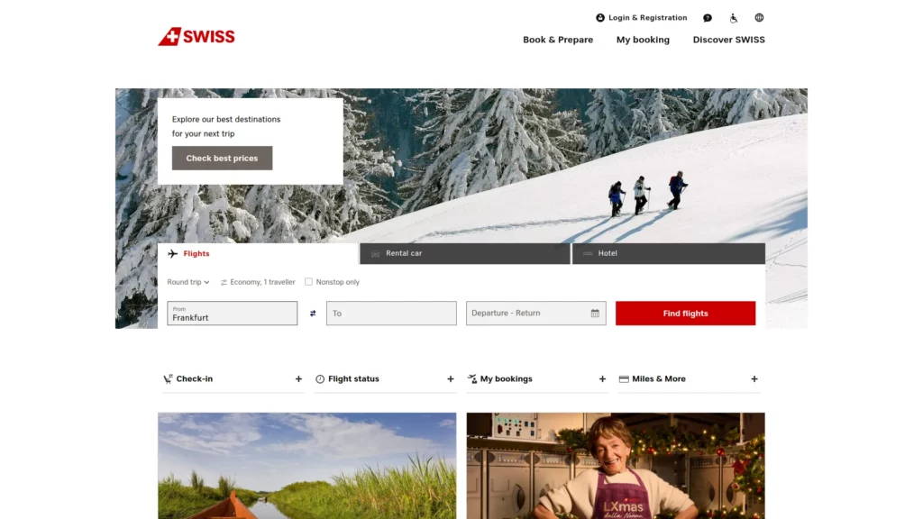
Swiss Air is one of the best responsive web design examples. It demonstrates sophisticated responsive thinking by fundamentally restructuring user priorities between desktop and mobile versions. On desktop, the flight search bar dominates above the fold, with secondary options (hotel, car rental) visible alongside branded imagery. On mobile, the layout compresses to a single-column experience with only the flight search immediately visible, reflecting user behavior data showing that mobile users typically have a single, focused intent: booking flights.
This isn’t lazy design that scales everything down; it’s intentional content hierarchy that acknowledges different user behaviors on different devices.
2. Dropbox – Device-Specific Call-to-Action Variation
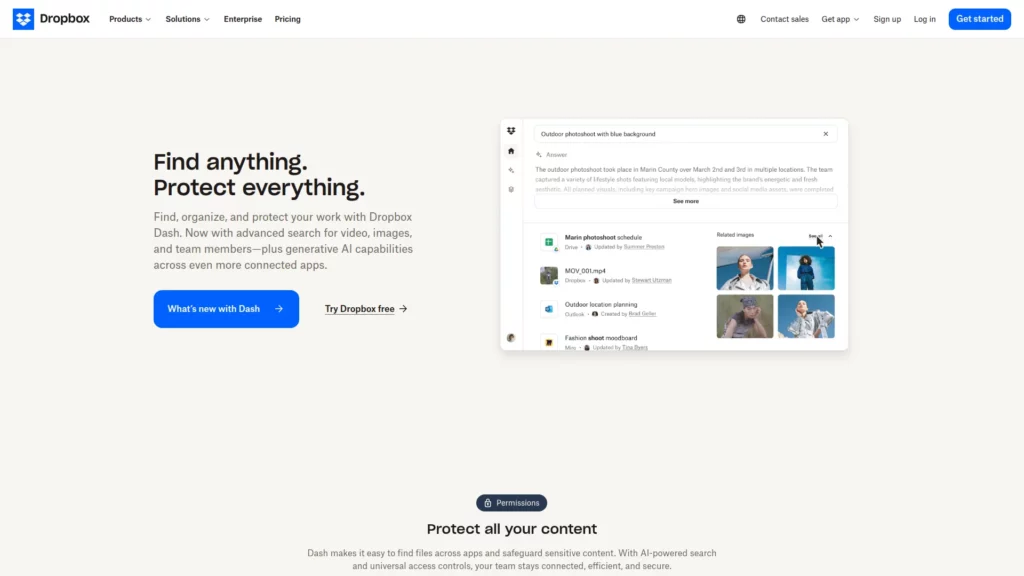
Dropbox’s responsive implementation reveals how even CTAs should adapt based on device context. The desktop version invites users to “Sign up for free,” while mobile and tablet versions present “Find your plan”—a subtle but meaningful shift reflecting the different decision-making processes users employ on different devices. Additionally, Dropbox maintains high-resolution product imagery on mobile rather than hiding visual assets, demonstrating that performance optimization and visual quality aren’t mutually exclusive with thoughtful image serving strategies.
3. Dribbble – Intelligent Grid Transformation
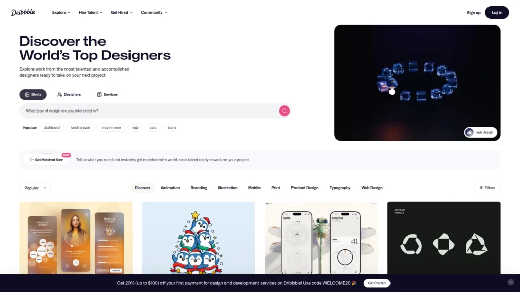
Design community Dribbble showcases masterful grid adaptation. On 13-inch laptop screens, portfolio projects display in a 4-column grid, providing visibility into multiple projects while maintaining click efficiency. On mobile phones, this scales to a single column, leveraging mobile users’ comfort with vertical scrolling while preserving legibility and interaction targets.
4. Etsy – Search Bar Prominence Across All Devices
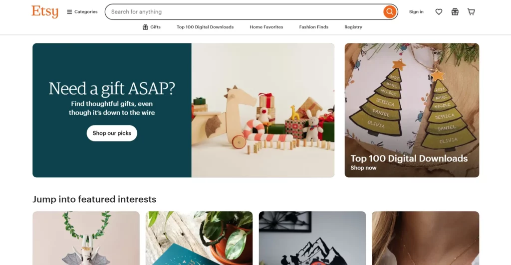
Etsy’s responsive design prioritizes discovering what users actually value by testing which elements matter most on each device. Notably, the search bar remains prominently positioned across desktop, tablet, and mobile versions—a design decision based on user research indicating that Etsy users typically browse with specific intent (“bridesmaid gifts,” “vintage furniture”) rather than casual browsing. The product grid itself adapts from multi-column on desktop to 2×2 and eventually single-column layouts on mobile, while maintaining the same strategic visibility for search functionality.
5. Forefathers Group – Typography and Navigation as Mobile-First Design

This design studio implements a mobile-first philosophy where the mobile experience isn’t an afterthought but rather the foundation for desktop expansion. On mobile, typography simplifies, navigation condenses to a hamburger menu, and CTAs (“Hire us”) abbreviate to conserve space. Rather than starting with desktop complexity and removing elements for mobile, Forefathers Group started with essential mobile functionality and progressively enhanced for larger screens—a philosophy that often produces cleaner, more intentional designs across all devices.
6. Cuberto – Animation and Responsive Performance Balance
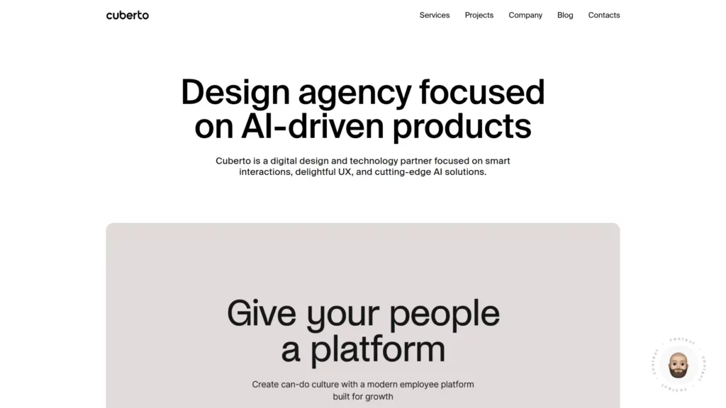
Cuberto, a digital agency, proves that sophisticated animations and responsive design aren’t adversaries. Using GSAP (GreenSock Animation Platform) strategically, the site maintains smooth transitions and visual polish across devices while ensuring these animations enhance rather than hinder the user experience. The off-canvas menu remains accessible on all screen sizes, and the visual hierarchy that draws users toward featured projects works equally well on mobile and desktop.
7. Magic Leap – Autoplay Behavior Differentiation

Magic Leap’s site demonstrates subtle but important responsive decisions: desktop automatically plays product videos to showcase technology, while mobile versions disable autoplay. This responsive approach acknowledges that mobile users often access content in different contexts (transit, limited data plans) and should have control over media playback rather than being surprised by autoplaying videos consuming their data.
8. Wired – Content-First Responsive Philosophy
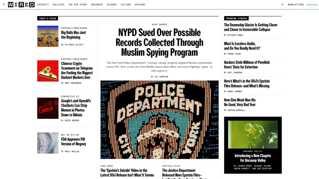
The online publication Wired exemplifies how news and editorial sites handle responsive design as one of the top responsive web design examples. The desktop version displays a three-column article grid with rich imagery and multiple ads. On mobile, this collapses to a single column for readability, and critically, ad placement and sizing adapt to mobile context. Rather than squeezing desktop ads onto mobile (which would overwhelm readers), Wired serves mobile-optimized ad units, respecting user experience while maintaining revenue generation.
9. The New York Times – Print-to-Digital Responsive Adaptation
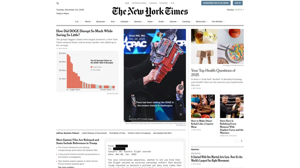
The New York Times successfully translates a century-old print publication format into a responsive digital experience. Desktop maintains a newspaper-like grid layout with clear information hierarchy, subscription CTAs, and comprehensive navigation. On mobile, this transforms into a streamlined 1×1 layout emphasizing individual stories, with contextual subscription prompts appearing at strategic moments rather than dominating above the fold. Interactive elements like game links remain accessible, creating a mobile experience that captures the essence of the print edition while optimizing for digital consumption.
10. Spotify – Platform Complexity Simplified Responsively
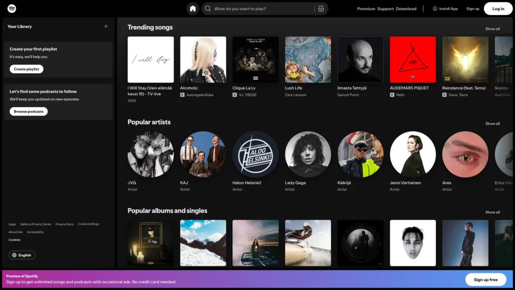
Music streaming requires complex interfaces managing enormous libraries, playlists, social features, and playback controls. Spotify’s responsive implementation maintains intuitive navigation across devices by dynamically restructuring menus—full navigation on desktop, hamburger menu on mobile—while keeping the core music player experience consistent. The player itself adapts its controls and layout based on available screen space, ensuring essential playback functions remain accessible on any device.
11. Airbnb – Information Density Responsive Adjustment
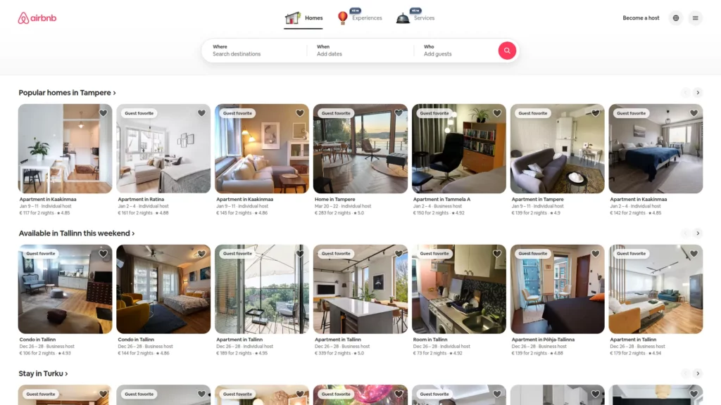
Airbnb’s accommodation listings contain enormous amounts of information: photos, descriptions, pricing, availability, reviews, and booking options. Rather than cramming everything on mobile screens, Airbnb’s responsive design strategically reveals and hides information based on device capabilities. On desktop, users see expansive property galleries and comprehensive details. On mobile, the interface prioritizes search and key differentiators, with deep details available through progressive disclosure (tapping to expand sections rather than endless scrolling).
12. GitHub – Contextual Form and Content Adaptation
GitHub is another good responsive web design example. It manages technical workflows requiring different information priorities for different devices. Desktop and tablet versions feature full signup forms alongside content descriptions, providing multiple conversion opportunities. Mobile versions simplify this to essential CTAs, recognizing that form-filling on mobile devices requires intentional effort and that users on mobile are often in different contexts (quick searches rather than extended browsing sessions).
13. Shopify – Menu Hierarchy and Information Architecture
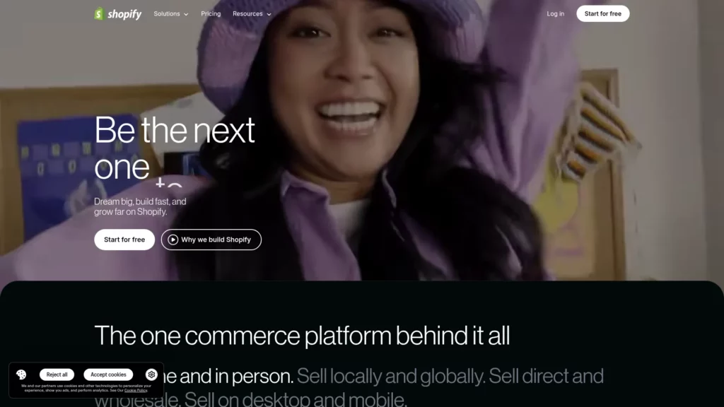
The Shopify website groups navigation into distinct cognitive categories, then uses responsive techniques to reveal these groupings intelligently. Desktop displays all navigation clearly; tablet and mobile hide these behind hamburger menus with dividing lines indicating the distinct cognitive groups. Remarkably, Shopify also includes footer navigation options in the mobile menu, recognizing that mobile users often don’t scroll to page footers and might miss crucial links.
14. Slack – Reduced CTAs and Content Compression
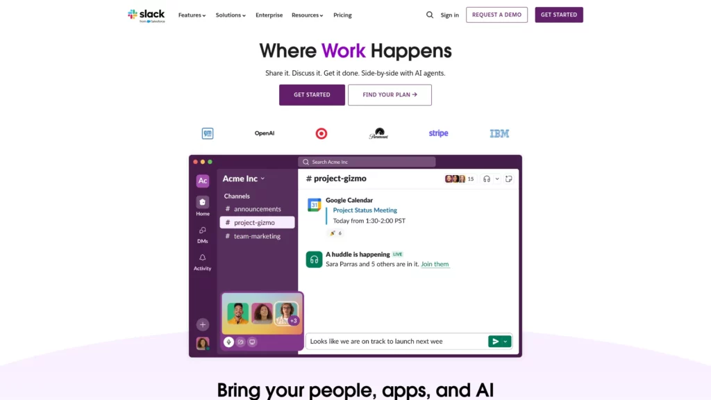
Slack’s mobile responsive design intentionally reduces above-the-fold CTAs from two to one, avoiding choice paralysis common in mobile interfaces. Rather than attempting to fit desktop content onto mobile screens, Slack compresses narrative content into fewer lines and ensures the single, prominent CTA receives attention. Product logos that span multiple lines on desktop reorganize into three condensed rows on mobile, optimizing space without sacrificing information.
15. The Scott Resort – Hero Video and Performance Considerations
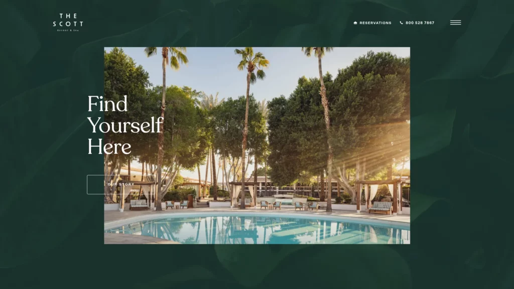
The Scott Resort integrates video backgrounds while maintaining responsive excellence—a technically challenging combination. The hero section uses GSAP for smooth animations and video integration, with animations scaling gracefully to mobile. Importantly, the site doesn’t force the same video experience on mobile connections; it adapts based on device capability and network conditions, balancing immersive experience with performance responsibility.
16. Ceremony Coffee – E-commerce Responsive Excellence

This coffee brand’s eCommerce site balances visual branding with responsive functionality. Product sliders highlight featured items across all devices, with animations adding elegance through GSAP integration. The fresh product display adjusts from multi-column grids on desktop to manageable layouts on mobile, while maintaining the Instagram feed integration that builds community engagement across devices.
17. 66° North – Adventure and Expedition Responsive Design
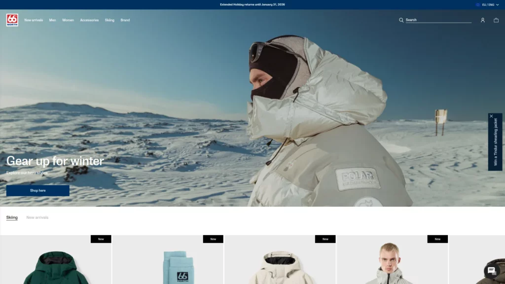
Specializing in polar expeditions, 66° North’s responsive site maintains visual storytelling across all devices. Stunning landscape imagery that would overwhelm mobile screens is sized appropriately, text overlays remain legible, and cool hover effects and smooth sliders work on touch devices. The design philosophy: preserve the sense of adventure and exploration on mobile while acknowledging different interaction patterns (touch vs. mouse hover).
18. Kern – Portfolio Display and Project Showcase

Kern, a design and identity studio, demonstrates how portfolios adapt responsively. Works are showcased in grids on desktop but display individually on mobile, with project details revealed through progressive disclosure. The site acknowledges that mobile users viewing portfolios often have different objectives (quick research, reference collection) than desktop users engaging in detailed exploration.
19. Maradji – Bohemian Elegance Across Devices

This French brand is one of the best responsive web design examples out there, maintaining a glamorous aesthetic across all screen sizes through careful animation and layout adaptation. Sliders showcase products beautifully on desktop and adapt to mobile touch interactions. The off-canvas menu on mobile preserves the brand’s luxe aesthetic while maintaining navigation accessibility, proving that responsive design can enhance rather than diminish brand identity.
20. Libratone – Audio Brand Responsive Design
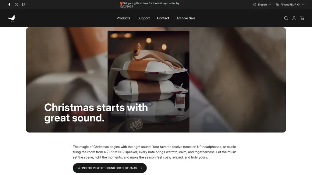
Libratone’s audio product website showcases how technical specifications and lifestyle imagery work together responsively. The hero section features product sliders that adapt to screen size, clear CTAs that remain prominent across devices, and quality images that communicate premium positioning regardless of device. The responsive implementation acknowledges that audio product shoppers research extensively across devices before purchasing.
21. V&A Museum – Cultural Institution Responsive Excellence
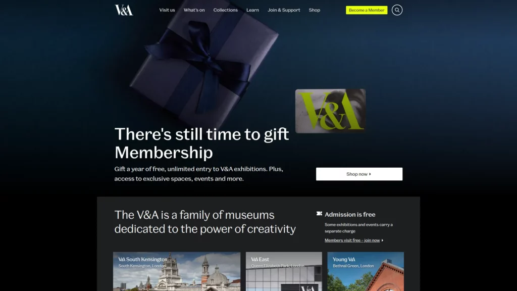
The Victoria & Albert Museum balances rich imagery with responsive accessibility. Opening hours and critical information receive prominent treatment on mobile (larger point size), while the hamburger menu with clear copy helps users understand navigation options. The responsive design respects that museum visitors often research during trips (often mobile) and need quick access to logistics information.
22. Smashing Magazine – Content Magazine Responsiveness
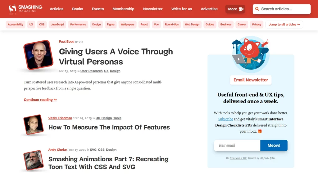
This design publication demonstrates how to handle content-rich layouts responsively. Despite visual complexity and numerous interactive elements, the responsive implementation maintains readability through intelligent typography and spacing. The “Topics” button transforms into a “Menu” button on smaller screens, consolidating breadcrumb elements without sacrificing navigation options.
23. Popular Science – Scientific Content Accessibility
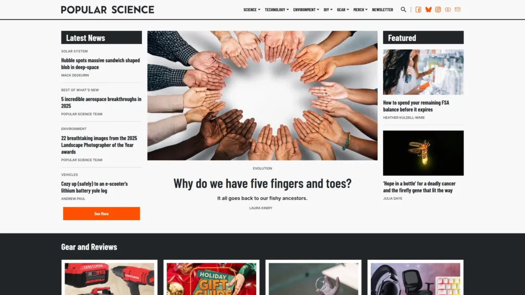
Popular Science showcases how technical and scientific content remains accessible across devices. Responsive imagery and clean typography allow complex topics to translate effectively to mobile without oversimplification. The content hierarchy remains consistent across devices, ensuring that readers understand the relative importance of different information regardless of screen size.
24. celerart. – Services and Portfolio Integration
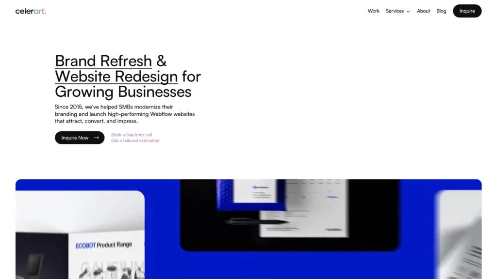
This design agency’s site demonstrates how responsive design works for service-based businesses. Desktop showcases work beautifully in detailed presentations, while mobile simplifies to essential project information with hamburger navigation and legible text. The responsive approach acknowledges that service business prospects often research on mobile but may require detailed information, which remains accessible through progressive disclosure.
25. New York City Ballet – Media-Rich Responsive Experience
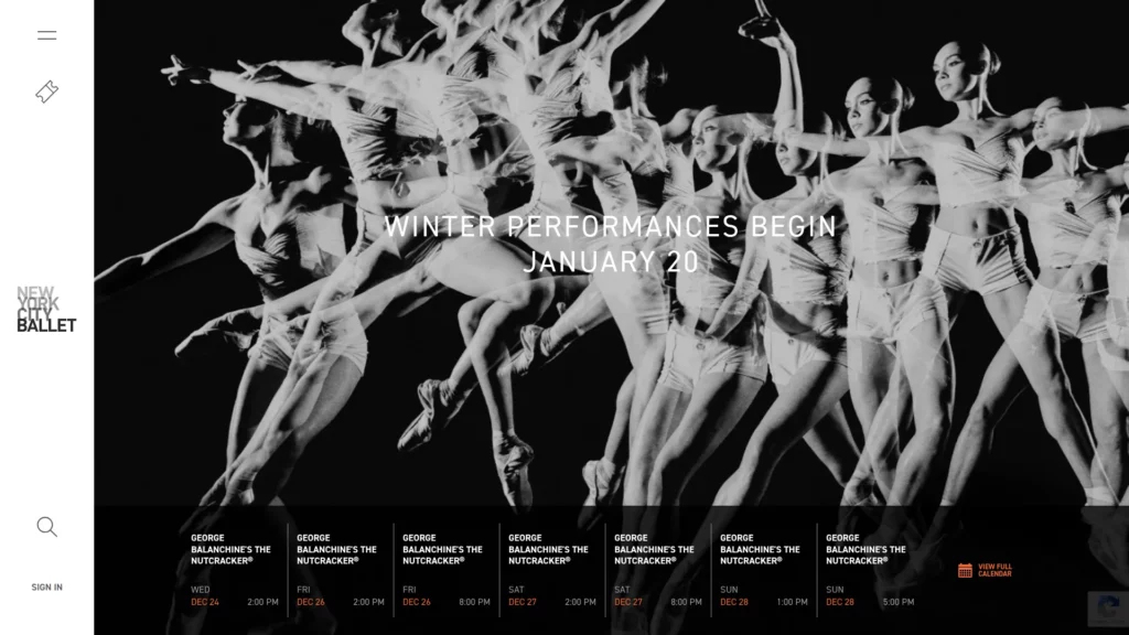
NYCB’s responsive site centers video content across all devices, giving potential audience members a preview of performance quality. The tablet and desktop share similar layouts reinforcing consistency, while the mobile experience simplifies to focus on CTAs and essential information. Navigation remains consistent across devices while show information adapts to available space, maintaining the user’s ability to explore without overwhelming mobile screens.
FAQs
Do I really need separate mobile and desktop designs, or is responsive design sufficient?
Responsive design is now the standard approach and typically superior to maintaining separate mobile and desktop websites. However, the responsive design for mobile should be genuinely optimized for mobile behavior and capabilities—not merely a scaled version of desktop.
How many breakpoints do I need?
Most responsive designs function well with three to four strategic breakpoints: mobile (320-480px), tablet (768-1024px), and desktop (1280px+). Rather than targeting every possible screen size, test your actual audience’s device mix and optimize for those specific breakpoints.
Should my mobile site have less content than desktop?
Not necessarily less content, but strategically prioritized content. Mobile users often have different immediate needs (quick answers, fast transactions) than desktop users (research, exploration, comparison). Responsive design should prioritize information hierarchy appropriately for each device context rather than arbitrary content reduction.
How important is page speed for responsive design?
Critical. Mobile networks remain slower than desktop broadband connections in many regions, and Google now emphasizes Core Web Vitals (which include loading speed) in rankings. Responsive design should include aggressive performance optimization: image optimization, code minimization, and strategic lazy-loading.
Do I need to use a CSS framework like Bootstrap?
No. While Bootstrap accelerates development and ensures baseline consistency, custom CSS Grid and Flexbox implementations often produce cleaner code and superior visual outcomes for branded projects. The choice depends on your team’s expertise, timeline, and design requirements.
What’s the future of responsive design?
Emerging technologies like container queries (targeting element-specific breakpoints rather than viewport-based breakpoints) and advanced CSS features are expanding responsive design capabilities. Artificial intelligence is also being explored for automated responsive optimization. However, the fundamental principles—flexibility, progressive enhancement, and user-centric design—remain constant regardless of technology evolution.
Conclusion
Great responsive web design examples do more than “fit the screen”. They protect readability, keep navigation effortless, and guide users to the next action no matter the device. The sites in this list show repeatable patterns you can borrow right away: flexible grids that simplify cleanly on mobile, touch-friendly menus, typography that scales without breaking hierarchy, and media that adapts without slowing the experience down.
As you build (or redesign) your own pages, use these responsive web design examples as a checklist: test real breakpoints, prioritize content order on small screens, validate forms with thumbs in mind, and measure performance as you add visuals. If you want a faster way to turn inspiration into an implementation plan, Designveloper can help you audit your current UI, map responsive patterns to your pages, and ship a consistent, device-ready experience that’s built for both users and search.

