
Informational websites help people learn, verify, and decide. They win when content is easy to find. They also win when content is easy to trust. This guide gives you patterns you can copy for your own site.

What is an Informational Website?
An informational website organizes knowledge for readers. It focuses on clarity, structure, and accessibility. It also uses trust signals to support credibility.
Best Informational Website Picks by Use Case
- Fast search and discovery: Wikipedia, Investopedia
- Long-form reading experience: The New York Times, The Guardian
- Structured learning journeys: Khan Academy, Coursera
- Topic authority in health and finance: WebMD, Investopedia
- Visual storytelling that teaches: National Geographic, TED-Ed
Quick Comparison
| Example | Best for | UX pattern to copy | Trust signal to copy | Common watch-out |
| Wikipedia | Reference lookups | Table of contents + deep internal links | Citations and edit history patterns | High-density pages can feel intimidating |
| Britannica | Curated knowledge | Clean reading layout + guided exploration | Editorial framing and consistent taxonomy | Less “open exploration” than community models |
| The New York Times | Premium reading | Typography-driven hierarchy | Clear separation of news, opinion, and analysis | Paywalls can interrupt journeys |
| BBC News | News scanning | Modular cards + topic hubs | Consistent labeling and story context | Homepage density can distract |
| The Guardian | Explainers | Related-coverage rails | Transparency and reader relationship cues | Prominent donation prompts can compete with content |
| Khan Academy | Self-paced learning | Skill paths and progressive disclosure | Clear learning objectives and structure | Catalog navigation must stay simple at scale |
| Coursera | Credential discovery | Filters and comparison-friendly listings | Institutional association cues | Decision fatigue if pages feel “too marketplace” |
| Udemy | Quick skill shopping | Strong search + sorting | Consistency in course-page information blocks | Too many options without guidance |
| WebMD | Symptom-style browsing | Topic clusters + “next question” paths | Medical disclaimers and review cues | Too many calls-to-action can reduce perceived calm |
| Investopedia | Definitions | Glossary-style templates | Consistent “what it means” formatting | Over-linking can interrupt reading flow |
| The Verge | Tech explainers | Visual hierarchy + sectioning | Clear labeling and structured story formats | Visual-heavy layouts must stay readable |
| National Geographic | Immersive storytelling | Scrollytelling and media pacing | Authority through editorial tone and sourcing cues | Performance and accessibility can suffer with heavy media |
| TED-Ed | Micro-lessons | Single-page learning modules | Clear learning intent and supporting resources | Video-first experiences need strong text support |
Encyclopedia & General Knowledge
1. Wikipedia
Wikipedia is built for fast lookups. It also supports deep exploration across topics. Use it when you need scale and breadth.
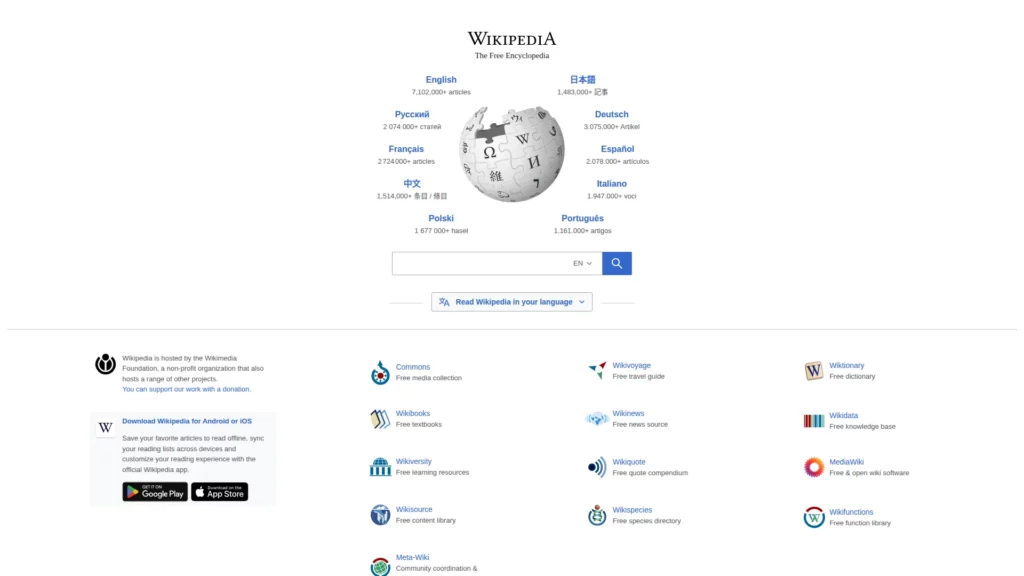
The uniqueness of Wikipedia lies in its community-driven model. Unlike traditional encyclopedias where expert editors control content, Wikipedia operates on principles of transparency and collective intelligence. With approximately 123 million registered user accounts globally and around 528,000 active editors (contributors making edits within the past thirty days), the platform represents the largest collaborative knowledge project ever created. The sheer scale of contributions—an estimated 100 million hours invested by the community since its inception—demonstrates unprecedented commitment to knowledge democratization.
Wikipedia’s strength extends to its quality control mechanisms. The platform employs sophisticated systems to assess article quality using standardized scales (from Stub-class to Featured Article status), maintains discussion pages where editors debate content accuracy, and enforces policies like verifiability and neutral point of view that shape editorial standards. A 2023 redesign introduced dynamic table of contents, improved search functionality, and responsive layouts—changes that resulted in 53% more clicks for logged-in users and a 28.9% increase in search initiation rates. These design iterations directly reflect how architecture influences information discovery.
2. Britannica
Britannica feels curated and calm. It prioritizes readability. It is ideal for editorial knowledge delivery.
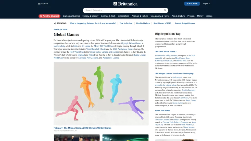
The transition to digital formats for Britannica began in 1994 with the launch of eb.com (requiring paid subscription), followed by the free Britannica.com in 1999. This hybrid model—offering free content supported by advertising while maintaining a premium subscription tier for complete access—proved remarkably resilient in the digital age. Notably, Britannica discontinued its print edition in 2012, fully committing to online distribution. The organization has recently incorporated AI-powered chatbot features (launched in 2024), balancing artificial intelligence with human expert validation to enhance user experience while maintaining editorial authority.
Britannica’s approach emphasizes expert curation and editorial authority. Unlike crowdsourced models, every article undergoes rigorous review by specialists in relevant fields, ensuring consistency of voice, factual accuracy, and depth that appeal to academic institutions, students, and knowledge-focused readers who prioritize reliability over speed.
News & Journalism
3. The New York Times
The New York Times shows strong reading hierarchy. It supports both scanning and depth. It is a model for premium information design.
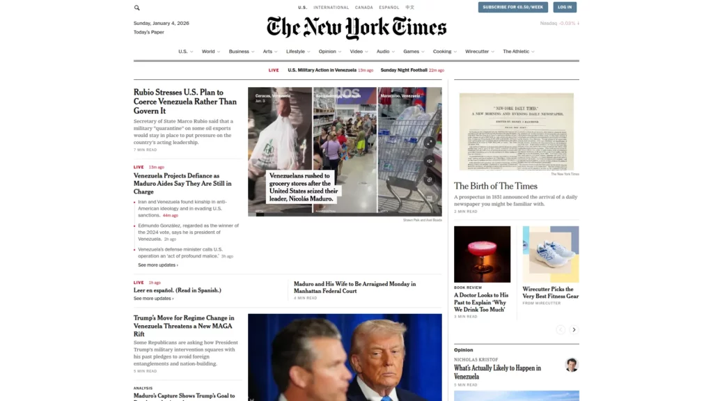
The platform’s distinctiveness rests on its rigorous editorial standards and institutional commitment to investigative depth. The Times maintains editorial guidelines explicitly requiring reporters to verify concrete facts (distances, addresses, phone numbers, titles) through standard references and official sources, with writers serving as their own principal fact-checkers accountable for accuracy. The organization published what may be the most comprehensive list of its editorial standards publicly available, documenting its commitment to integrity across all content categories. This transparency about editorial processes builds reader confidence in a fragmented media landscape.
Technologically, the Times invested heavily in its digital infrastructure. It launched NYTimes.com in 1996 as one of the first major newspaper websites. As the years went, it continuously iterated its design to enhance reader experience and article discovery. Recent UI updates emphasize cleaner article layouts, improved readability through typography, and streamlined navigation—design decisions that prioritize content consumption over distraction.
4. BBC News
BBC News is built for scanning. It also supports deep topic follow-ups. The layout stays predictable across sections.
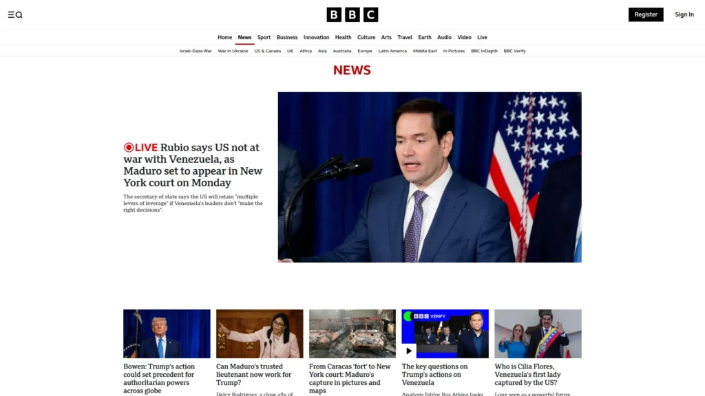
BBC News distinguishes itself through statutory impartiality requirements, embedded in British broadcasting law. Rather than pursuing “balance” (equal coverage of opposing views), BBC editorial standards mandate “due impartiality”—giving proportional weight to events, opinions, and main strands of argument, ensuring no significant strand of thought is underrepresented. This distinction influences everything from story selection to correspondent briefing. The BBC News app emerged as the leading news application in the UK by monthly reach (2024/25), and BBC Verify (the corporation’s fact-checking service) became the most-utilized fact-checking resource among UK adults.
Organizationally, the BBC operates with internal editorial separation, explicit conflict-of-interest policies, and regular updates to Editorial Guidelines (most recent edition published June 2025). The corporation also manages BBC iPlayer, which saw a 10% increase in requests during 2024/25, becoming the UK’s fastest-growing long-form video service.
5. The Guardian
The Guardian is strong at explainers. It keeps readers moving across a topic. It does this through related coverage and hubs.
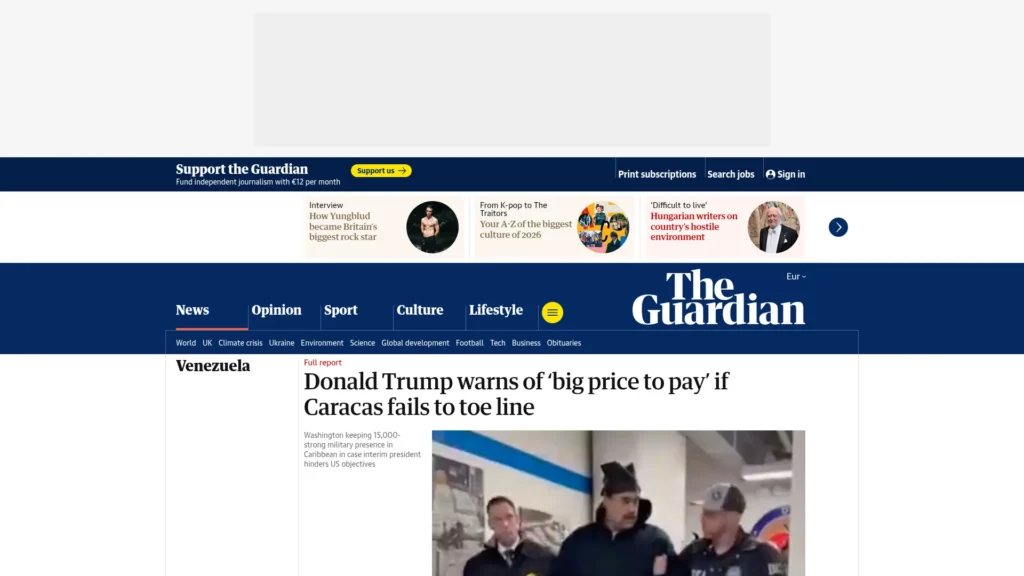
The Guardian’s defining characteristic is its unique governance and funding model. The newspaper is owned by The Scott Trust, a nonprofit organization established in 1936 to secure the financial and editorial independence of the publication “in perpetuity.” This structure insulates The Guardian from shareholder pressure and commercial media conglomerate control. Consequently, the organization prioritizes investigative reporting and editorial independence over profit maximization—a positioning clearly reflected in its approach to subscription and supporter revenue.
This independence manifested in major investigative achievements. These include the Snowden revelations (2013), the Panama Papers investigation (2016), and ongoing global investigations into topics like government accountability, corporate misconduct, and human rights abuses. The Guardian added over 150,000 new recurring digital supporters in 2024/25, growing its global supporter base to 1.3 million, with digital reader revenue reaching £107.3 million (21.7% growth year-over-year). Notably, 56% of The Guardian’s digital revenue originates outside the UK, demonstrating global reader commitment to independent journalism.
Education & E-Learning
6. Khan Academy
Khan Academy is built for self-paced learning. It turns lessons into clear journeys. It also stays friendly for beginners.
Khan Academy’s scale is extraordinary: 120 million learners globally accessed the platform in 2025, with 13.7 million new learners joining that year alone. The organization offers over 70,000 practice problems translated into more than 50 languages, covering disciplines from mathematics and sciences to history, literature, economics, and computer science. During 2025, learners collectively spent 7.7 billion minutes on the platform—testament to engagement depth. Beyond its core learning platform, Khan Academy expanded into institutional partnerships, establishing Khan Lab School in Silicon Valley and Khan World School in collaboration with Arizona State University, demonstrating belief that personalized mastery education extends beyond digital interfaces.
The platform’s pedagogical approach emphasizes short-form video instruction paired with interactive practice exercises. Research validates this methodology: during the 2022-23 school year, a study of 350,000 students found that those using Khan Academy for at least 30 minutes weekly experienced a 20% greater-than-expected learning gain, with an effect size of 0.36—evidence that the platform’s design produces measurable educational outcomes. The organization revenue reached $107.3 million in 2023, supported entirely through institutional donors and corporate grants, eliminating conflicts between monetization and educational quality.
7. Coursera
Coursera helps people compare options. It supports decision-making with structure. It also uses credibility cues well.
Coursera’s business model balances open access with revenue generation through a three-segment approach: a consumer segment (individual learners), an enterprise segment (corporate upskilling programs), and a degree segment (full academic credentials). During 2024, learners completed 49.5 million course enrollments (a 9-10% increase from 2023), viewed 585.2 million lectures, and completed 98.2 million assessments. Notably, 45% of Coursera learners access content via mobile devices, with India showing the highest mobile adoption at 53%—reflecting the platform’s global accessibility focus. The organization generated $694.7 million in revenue in 2024, representing a 9% increase from 2023, driven particularly by enterprise customer growth (18% YoY increase to 1,612 paid customers) and degree enrollment expansion (22% growth).
The platform’s unique value proposition lies in its university partnership model, where courses designed by Stanford, Yale, MIT, and other prestigious institutions maintain academic credibility while becoming globally accessible. This architecture allows Coursera to offer Generative AI-focused courses—which achieved 3.3 million enrollments in 2024, with enrollment rates accelerating from 1 per minute in 2023 to 6 per minute in 2024—demonstrating the platform’s ability to rapidly integrate emerging fields.
8. Udemy
Udemy is search-driven. It handles huge catalogs. It helps users decide quickly.
Udemy’s marketplace economics fundamentally differ from traditional e-learning models. The platform hosts over 17,700 free courses, which serve as low-friction onboarding mechanisms: over 28 million consumer learners have enrolled in free courses, with 3.7 million eventually converting to paid course purchasers. This funnel model proves cost-effective for customer acquisition while democratizing access. For instructors, revenue sharing arrangements incentivize quality and promotional effort: instructors earn 37% of revenues from platform sales and 97% when learners purchase through instructor coupon or referral links. This structure generated $161.4 million in instructor earnings in 2020, with the average instructor earning $2,950 and over 9,000 instructors earning in excess of $1,000 annually—validating that knowledge work can be sustainably monetized at scale.
In November 2025, the platform recorded 68.72 million visits with users spending an average of 16 minutes 9 seconds per session. This is the highest engagement duration among the three educational platforms analyzed. Such engagement depth reflects Udemy’s instructional design emphasis on practical, immediately applicable skills. The platform also serves enterprise markets through Udemy for Business, demonstrating B2B scalability of its instructor-creator model. Notably, Fortune 100 companies recognize skills gained through Udemy courses, with 80% of them acknowledging the value of Udemy-based instruction in employee development.
Niche Authority
9. WebMD
WebMD structures sensitive content carefully. It guides users through related questions. It aims to reduce confusion and panic.
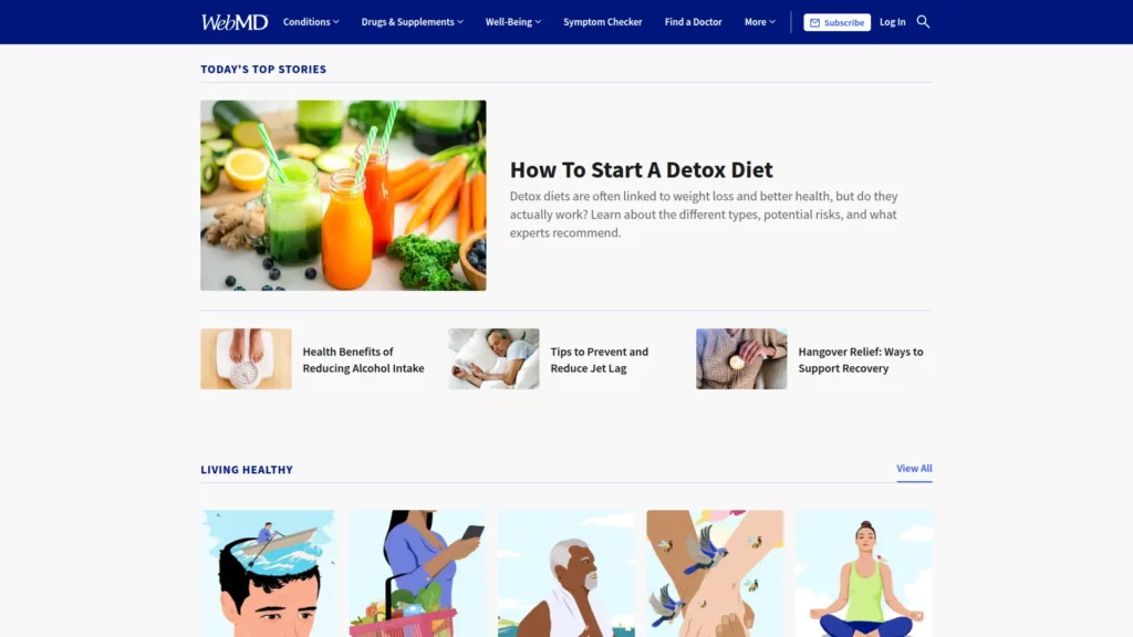
The platform’s strength rests on its URAC accreditation, maintained continuously since 2001 regarding content accuracy, proper disclosures, security standards, and privacy protections. WebMD provides multiple features serving different user needs: a comprehensive symptom checker, pharmacy and medication databases, physician-written blogs organized by medical specialty, and secure personal health record storage. The organization operates within regulated healthcare information standards, distinguishing it from general informational websites.
However, WebMD faces significant challenges in 2025. The platform experienced a major traffic decline of 31.2 million visits (compared to May 2024), with search traffic falling 15 million visits month-over-month in May 2025 alone. This decline stems from structural shifts in health information-seeking behavior: the November 2022 launch of ChatGPT and the May 2024 introduction of Google AI Overviews have redirected users toward conversational health tools offering personalized interaction that traditional article-based platforms cannot replicate. Despite these headwinds, WebMD remains architecturally influential for demonstrating how specialized domains (healthcare) demand distinct editorial, content, and credibility structures compared to general informational sites.
10. Investopedia
Investopedia excels at definitions. It uses consistent templates. It makes complex ideas feel manageable.
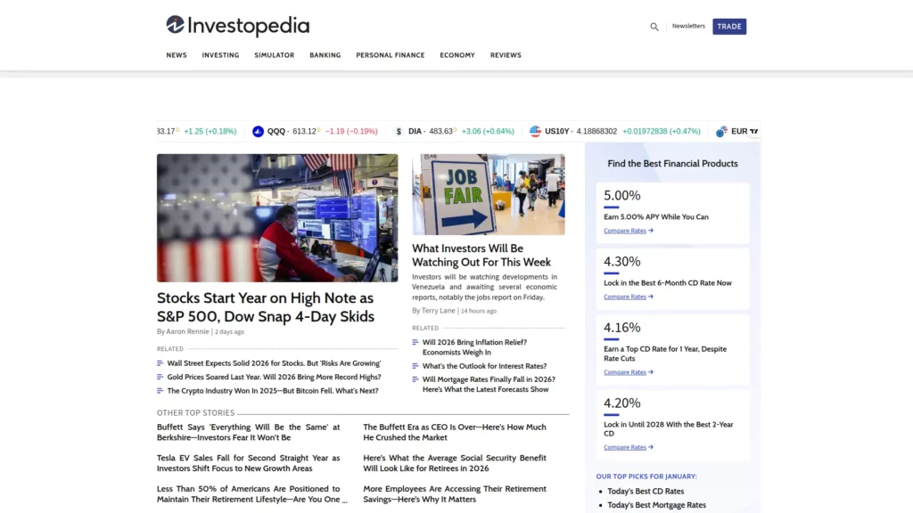
The organization’s mission—maintained consistently for 25 years—centers on empowering individuals to make informed financial decisions for themselves, families, and businesses. Investopedia is wholly owned by IAC Publishing, part of IAC (Interactive Analytics Consulting), which operates one of the web’s largest digital media portfolios reaching users in over 200 countries. The platform distinguishes itself through expert contributor networks: Investopedia established an Advisor Council of editorially-selected independent financial advisors committed to financial literacy accessibility, who contribute articles and editorial guidance ensuring content credibility and relevance.
In 2025, Investopedia expanded into premium education offerings through its E-Learning team, creating and selling specialized investing and finance courses to its user base. This evolution reflects broader informational website trends: combining free educational content (traffic generation and brand building) with premium knowledge products (revenue generation and deeper engagement). The platform’s architecture emphasizes actionable financial insights rather than entertainment—its stated organizational goal is to “provide actionable insights to our visitors to make them smarter investors.”
11. The Verge
The Verge blends news and explainers. It uses strong visual hierarchy. It also keeps formats recognizable.
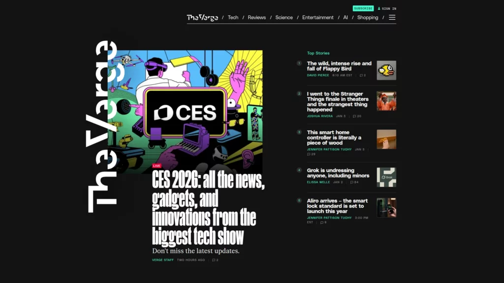
The platform’s editorial philosophy emphasizes independence and critical journalism. The Verge publishes strict ethics policies (available publicly on its website) establishing that editorial staff cannot accept goods or services from companies being covered, cannot accept preconditions for coverage, and maintain independence from advertising teams through explicit structural walls. The ethics statement explicitly reserves the right to be critical of covered companies and individuals, stating the site is “most proud of our work when we tell stories that people in power would prefer not see the light of day.”
Notably, The Verge underwent a significant website redesign in September 2022, resulting in interesting traffic patterns. While total monthly visitors declined from 17.3 million (September 2021 – August 2022) to 11 million (September 2022 – August 2023), the redesign successfully converted casual readers into loyal users: the loyal reader base (defined as readers visiting at least five times monthly) increased 62% from January to September 2023. This demonstrates that quality design and editorial focus can shift user behavior toward deeper engagement even when total traffic contracts. In December 2024, The Verge launched its first sitewide subscription product, reflecting industry-wide movement toward reader-supported journalism—a paywall charging $7 monthly or $50 annually for premium reports, newsletters, and reviews.
Visual & Immersive Storytelling
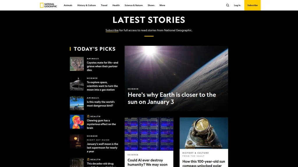
12. National Geographic
National Geographic teaches through immersive media. It uses pacing to guide attention. It also sets context before visuals take over.
The platform’s unique value proposition centers on mission-driven journalism rather than entertainment optimization. National Geographic explicitly operates as a mission-driven organization (not celebrity-driven), with editorial standards emphasizing scientific rigor, ethical storytelling, and environmental/cultural expertise. In 2017, Editor Susan Goldberg published a candid retrospective acknowledging that historically, National Geographic’s coverage perpetuated racist imagery and presented non-white communities as exotic subjects. This self-critique led to intentional editorial reformation, demonstrating institutional accountability and commitment to evolving standards.
National Geographic’s design philosophy prioritizes sophisticated visual presentation through interactive graphics, high-definition video, and responsive web design. A significant example: the Serengeti Lion feature (“Serengeti Lion: Life on the Plains With the Vumbi Pride”) in the August 2016 issue drew from 200 hours of film footage and high-definition video captured by cinematographer Nathan Williamson over photographer Michael Nichols’ 12-month field assignment. This multimedia presentation gave readers “the closest experience to living with lions short of joining the photographer in his Land Rover,” exemplifying how detailed curation and technical sophistication transform visual information into immersive experience.
13. TED-Ed
TED-Ed packages learning into modules. It keeps the lesson flow predictable. It also supports video with supporting materials.
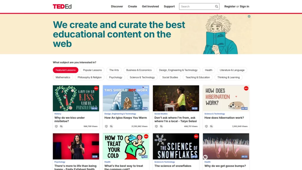
The platform’s distinctive model involves nomination and refinement: educators worldwide submit lessons through open submission, TED-Ed reviews submissions to refine pedagogical content (ensuring lessons remain under 10 minutes), and then professional animators and visualization specialists bring lessons to life through animation, motion graphics, or other visual techniques. This curator-plus-creator model has generated over 1,700 animated videos (as of 2025) viewed collectively over 5.8 billion times—equivalent to thousands of years of cumulative viewing. The platform attracts diverse educators: college professors, high school teachers, researchers, practitioners, and subject-matter experts, all contributing to a global educational resource library.
TED-Ed’s pedagogical approach emphasizes visualization of abstract concepts. Complex topics—cell division, historical causation, mathematical principles, scientific phenomena—benefit from animation that sequential static diagrams cannot achieve. By pairing rigorous educational content with visualization, TED-Ed creates learning experiences where visual metaphors and kinetic explanation enhance conceptual comprehension. The platform also facilitates educator partnerships with organizations like Character Lab (psychology research), allowing scientific expertise to guide educational content development. Notably, TED-Ed videos achieve higher average views-per-video metrics than many other TED channels, suggesting that animated educational content resonates with audiences across age groups and educational backgrounds.
FAQs
What is the best platform to build an informational website?
The best platform depends on your content scale. It also depends on your taxonomy needs. Choose a CMS that supports templates, structured content, and SEO tooling.
How do informational websites make money?
Common models include ads, sponsorships, and memberships. Affiliate revenue is also common. Keep monetization clearly labeled to protect trust.
What is the difference between a blog and an informational website?
A blog usually centers on posts and publishing cadence. An informational website centers on a knowledge system. It relies on hubs, evergreen pages, and reference-friendly navigation.
Conclusion
Great informational websites feel calm. They also feel reliable. Users should find answers fast, then verify them easily. That requires strong structure, not just good visuals.
At Designveloper, we’re based in Ho Chi Minh City, Vietnam. We were formed in 2013. We’ve delivered over 100 successful projects. We’ve also logged 500K+ working hours across complex builds.
When you want an informational website that scales, we focus on the fundamentals. We design clear taxonomies and hub pages. We can help build templates that stay consistent, that prioritize speed, accessibility, and content governance. Our delivery covers Web App Development, Mobile App Development, Software Development, Cyber Security Consultant, AI Development Services, and VOIP App Development so your product stays cohesive end to end.
If you need proof that we can ship real products, our portfolio includes LuminPDF, Walrus Education, and Swell & Switchboard. Those projects shaped how we build for clarity and trust. They also shaped how we design for long reading sessions.

