
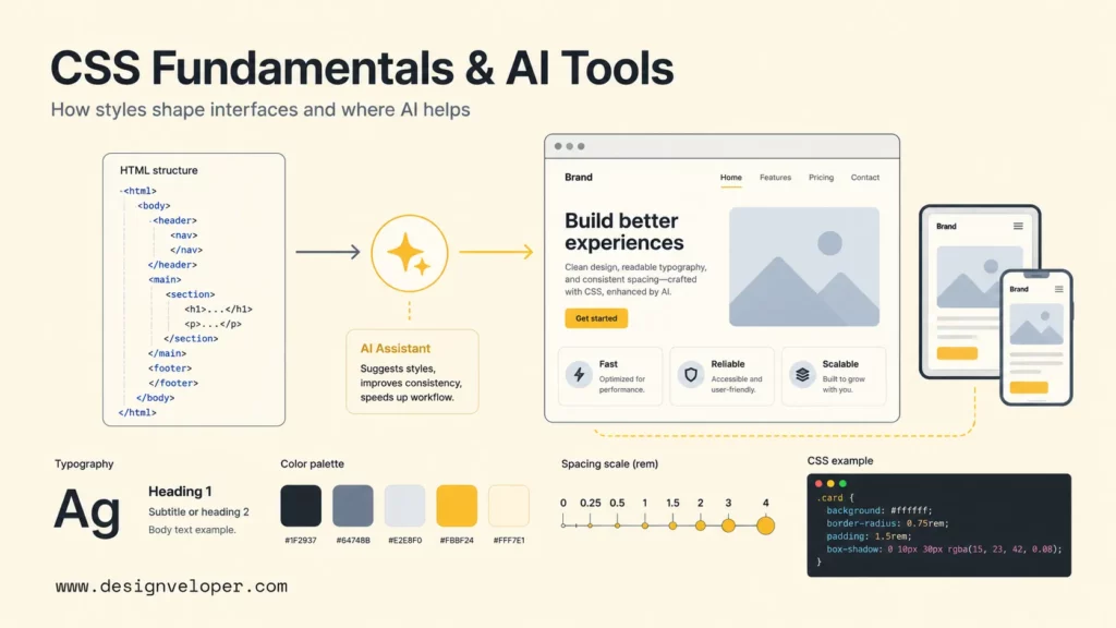
What is CSS? CSS, or Cascading Style Sheets, is the stylesheet language that controls how HTML and XML content looks on a screen. HTML gives a web page its structure; CSS controls presentation such as fonts, colors, spacing, layouts, responsive behavior, states, and visual effects. Without CSS, most websites would still have headings, paragraphs, lists, forms, and links, but the experience would look plain and would be much harder to adapt across phones, tablets, and desktops.
CSS is also where web design becomes implementation. A designer may define brand colors, spacing rules, typography, button states, cards, grids, and breakpoints. A developer turns those decisions into reusable CSS rules, component styles, utility classes, design tokens, or framework configuration. MDN’s CSS reference describes CSS as the language used to describe document presentation, including layout, colors, and fonts.
AI CSS tools now help developers generate snippets, prototype HTML/CSS faster, explain unfamiliar styles, and refactor messy declarations. AI can speed up routine styling, but AI does not remove the need to understand selectors, the box model, layout, cascade, specificity, accessibility, and maintainability. This guide explains CSS fundamentals first, then shows where AI CSS tools fit safely in real web development work.
What Is CSS?
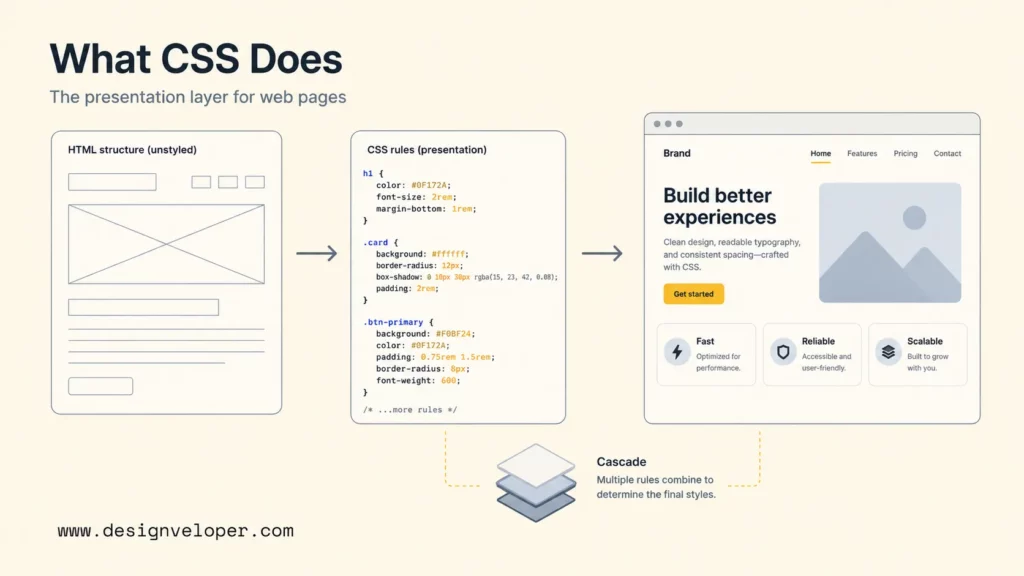
CSS is a stylesheet language that tells the browser how structured content should be presented. CSS rules target HTML elements, classes, IDs, attributes, pseudo-classes, and pseudo-elements, then assign values to visual properties. A simple rule such as p { color: #333; line-height: 1.6; } tells the browser to render paragraph text in a dark color with readable spacing between lines.
The “cascading” part of CSS means multiple style rules can apply to the same element, and the browser uses a defined algorithm to decide which declaration wins. That algorithm considers origin, importance, cascade layers, specificity, scoping proximity, and order. MDN’s CSS cascade documentation is useful because it explains that the cascade is more than “the last rule wins.”
CSS matters because it separates content from presentation. A heading can remain a heading in HTML, while CSS decides whether the heading appears bold, centered, responsive, animated, or aligned in a grid. That separation helps teams update visual systems without rewriting page structure.
What CSS Is Used For
CSS is used to turn structured web content into a usable interface. CSS controls how text reads, how components occupy space, how layouts respond to screen size, and how users recognize interactive states. Strong CSS improves readability, usability, accessibility, brand consistency, and front-end maintainability.
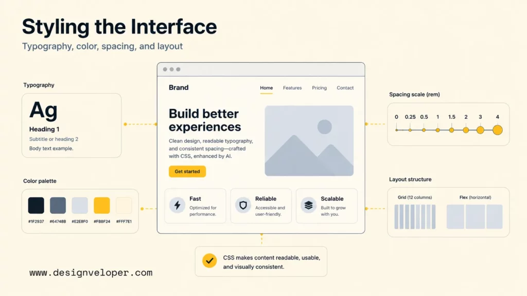
Typography, Color, And Spacing
Typography, color, and spacing are the first visible jobs of CSS. CSS sets font families, sizes, weights, line heights, letter spacing, text alignment, background colors, borders, shadows, and spacing between elements. Those choices decide whether a web page feels readable, dense, calm, energetic, formal, or playful.
Good CSS does more than make a website pretty. A consistent spacing scale helps readers scan content. A clear color system helps users distinguish actions, warnings, links, and disabled states. A readable typographic scale helps headings, body text, captions, and labels work together. The web.dev Learn CSS course covers text styling, color, spacing, and other core modules as part of practical CSS learning.
Layouts And Responsive Design
CSS layout decides where things go. Modern CSS uses block and inline formatting, flexbox, grid, positioning, flow layout, container queries, media queries, and intrinsic sizing to make interfaces adapt across devices and content lengths.
Flexbox is useful for one-dimensional alignment, such as nav bars, button groups, input rows, and card internals. MDN’s flexbox basic concepts guide explains that flexbox distributes space along one axis and provides powerful alignment controls. CSS Grid is useful for two-dimensional layouts, such as full-page structures, gallery grids, dashboards, and forms with rows and columns. Responsive design combines those layout tools with fluid units, breakpoints, and content-aware decisions.
States, Transitions, And Visual Effects
CSS also controls states and motion. Hover, focus, active, disabled, checked, and invalid states help users understand what they can do. Transitions and animations can make state changes smoother, such as opening a menu, fading a modal, highlighting a validation error, or moving a carousel.
State styling is not decoration alone. Focus styles help keyboard users navigate. Error styles help form users fix input. Loading skeletons can reduce perceived wait time. Reduced-motion media queries help users who prefer fewer animations. CSS visual effects should support comprehension, not distract from the task.
How CSS Works
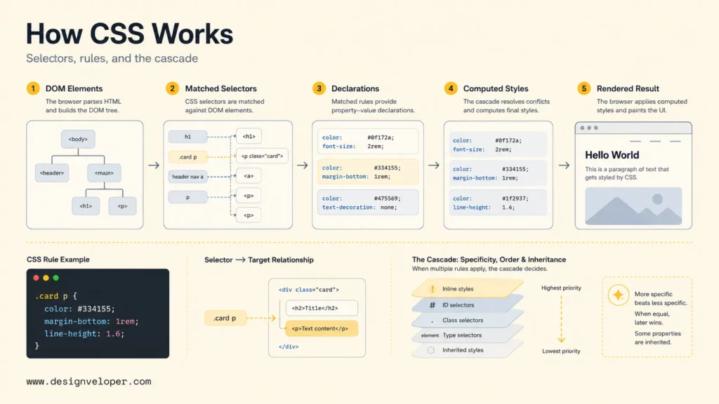
CSS works by matching selectors to document elements, applying property-value declarations, and resolving conflicts through the cascade. The browser parses HTML into the DOM, parses CSS into stylesheets, calculates computed styles for each element, then paints the page according to layout, visual, and interaction rules.
Selectors, Properties, And Values
A CSS selector identifies which elements a rule targets. Selectors can target element names, classes, IDs, attributes, relationships, states, and pseudo-elements. For example, .card h2 targets every h2 inside an element with the class card. MDN’s CSS selectors reference documents the selector patterns developers use to target elements precisely.
Properties define what changes. Values define how the property changes. In color: rebeccapurple;, color is the property and rebeccapurple is the value. In display: grid;, display is the property and grid activates grid layout behavior.
Rule Blocks And Basic Syntax
A CSS rule block includes a selector, curly braces, and one or more declarations. Each declaration has a property, a colon, a value, and a semicolon. A beginner-friendly rule looks like this:
.button { background: color: white; padding: 0.75rem 1rem; border-radius: 0.5rem;}That syntax is simple, but maintainable CSS depends on naming, grouping, and scope. A project should avoid random one-off selectors when a reusable component class, utility class, or design token would be clearer. Good CSS syntax is readable today and changeable six months later.
The Cascade, Specificity, And Inheritance
The cascade, specificity, and inheritance explain why one style wins over another. The cascade sorts declarations by origin, importance, cascade layer, specificity, scoping proximity, and order. Specificity gives some selectors more weight than others. Inheritance passes some property values from parent elements to children.
Specificity often confuses beginners because a later rule does not always win. A class selector usually beats an element selector. An ID selector has even more weight. Inline styles sit in a different part of the cascade. The web.dev specificity guide and MDN’s CSS specificity documentation both explain why low-specificity, well-scoped CSS is easier to override and maintain.
The Three Ways To Apply CSS
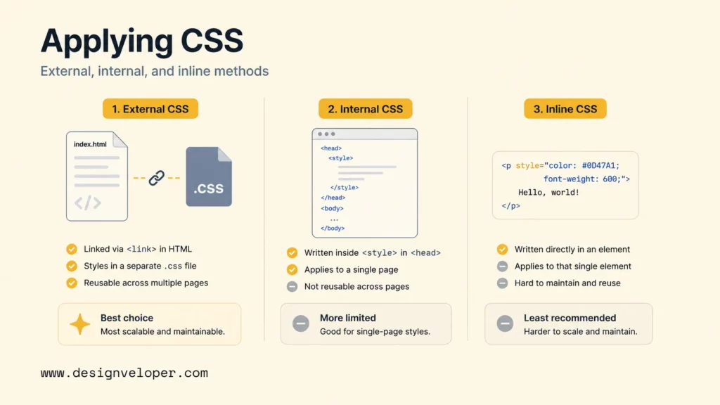
CSS can be applied externally, internally, or inline. External CSS is the normal choice for maintainable websites. Internal CSS can work for small pages or experiments. Inline CSS is useful for rare dynamic cases but becomes hard to maintain when overused.
External CSS
External CSS lives in one or more .css files linked from HTML. This is the most maintainable approach because multiple pages can share the same visual system. A site can have a base stylesheet, component styles, page-specific styles, or generated CSS from a build system.
External CSS supports caching, reuse, collaboration, and cleaner HTML. Teams usually combine external CSS with architecture decisions such as CSS Modules, Sass, PostCSS, Tailwind CSS, design tokens, or component-scoped styles, depending on the technology stack.
Internal CSS
Internal CSS sits inside a <style> element in the HTML document. It is useful for quick demos, email templates, documentation examples, or a single standalone page. Internal CSS becomes harder to manage when many pages need the same styles.
A simple internal stylesheet can be appropriate when the goal is speed and isolation. For production websites, external or component-scoped styles usually make ownership and reuse clearer.
Inline CSS
Inline CSS appears directly on an HTML element through the style attribute. It can be useful for dynamic values generated by JavaScript, email-client constraints, or rare one-off overrides. Inline CSS should not become the default style method for a website.
Inline styles are difficult to reuse, test, override, and audit. Overusing inline CSS can also hide design-system drift because visual decisions become scattered across markup instead of living in a shared style layer.
Common CSS Challenges Developers Run Into
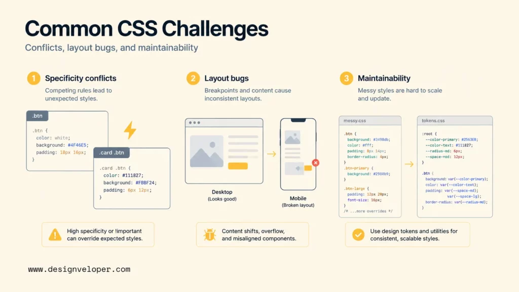
Common CSS challenges come from conflicts, layout surprises, browser differences, and maintainability problems as a project grows. CSS is approachable at the beginning, but large CSS systems require structure, naming discipline, testing, and review.
Specificity Conflicts
Specificity conflicts happen when developers fight earlier rules with stronger selectors, repeated overrides, or !important. A quick override may fix one screen while making future changes harder. Specificity issues often appear in large projects with global styles, legacy themes, third-party CSS, and inconsistent naming.
Useful fixes include lower-specificity selectors, cascade layers, component boundaries, utility classes, design tokens, and removing unused rules. MDN’s cascade documentation now includes cascade layers, which help teams organize style precedence intentionally instead of relying only on selector weight and file order.
Layout Bugs And Cross-Browser Differences
Layout bugs often come from misunderstanding width, overflow, margins, min-content sizing, flex wrapping, grid tracks, absolute positioning, or the box model. A layout may work on a desktop monitor and break on a small phone, a translated label, a zoomed browser, or a different operating system.
Cross-browser differences are less painful than they were years ago, but teams still need browser testing for newer features, accessibility states, form controls, scroll behavior, and responsive layouts. MDN’s responsive design guide recommends flexible layouts and breakpoints based on content, not only device names.
Keeping Styles Maintainable As Projects Grow
CSS maintainability becomes harder when every new feature adds another layer of styles without deleting old rules. A growing project needs naming conventions, component ownership, reusable tokens, documentation, linting, visual review, and a clear decision about where styles live.
A practical maintainability checklist includes:
- Use design tokens for colors, spacing, typography, radius, and shadows.
- Prefer reusable components or utilities over page-specific one-offs.
- Keep specificity low unless there is a clear reason.
- Remove dead CSS when components are deleted.
- Test responsive states, focus states, empty states, and long content.
- Document unusual layout choices near the component or design system.
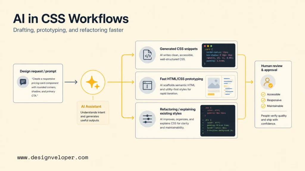
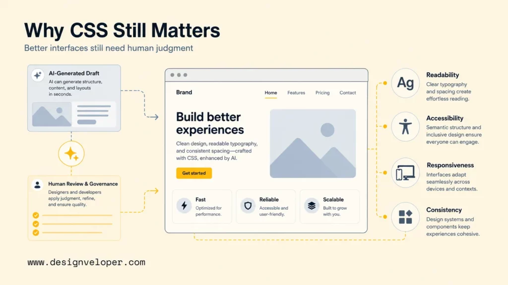
AI CSS tools are changing developer workflows by reducing blank-page friction, speeding up prototypes, explaining unfamiliar styles, and helping teams refactor repetitive CSS. The strongest use case is acceleration. The risky use case is accepting generated styles without checking layout, accessibility, maintainability, and browser behavior.
Generating CSS From Prompts
AI CSS generators can turn prompts into CSS snippets, utility classes, component styles, or design variations. A developer can ask for a responsive card grid, a sticky header, a dark-mode palette, a CSS-only toggle, or a form layout. Tools such as GitHub Copilot, Cursor, ChatGPT, and Claude can produce useful first drafts when the prompt includes framework, constraints, and target behavior.
Prompt-generated CSS should still be reviewed. AI may choose inaccessible color contrast, unnecessary absolute positioning, fragile fixed heights, excessive nesting, or properties that conflict with existing design tokens. A good prompt includes constraints such as “use existing CSS variables,” “support keyboard focus,” “avoid fixed pixel heights,” and “do not change markup.”
Accelerating HTML/CSS Prototyping
AI is especially useful for HTML/CSS prototyping because visual feedback is immediate. A developer can generate a pricing card, dashboard shell, navigation pattern, or onboarding form, then inspect the result in a browser. The prototype helps teams discuss layout and interaction earlier.
Prototype speed should not erase front-end fundamentals. The Stack Overflow 2025 Developer Survey shows that many developers use or plan to use AI tools, but accuracy, security, and privacy concerns remain high. For CSS, that means AI output should be treated as a draft that needs browser checks, accessibility checks, and maintainability review.
Refactoring And Explaining Existing Styles
AI tools can explain why a selector applies, find duplicate declarations, suggest a lower-specificity replacement, convert repeated values into tokens, or refactor a messy component stylesheet. That is valuable when a developer inherits legacy CSS or a large framework-heavy project.
The best refactoring prompts include real context: HTML structure, the existing CSS, the desired behavior, screenshots when available, and constraints such as “keep class names stable” or “do not change public markup.” AI can propose a cleaner stylesheet, but a developer still needs to run visual regression checks and inspect responsive states.
Where AI CSS Still Needs Human Review
AI CSS needs human review anywhere visual output affects usability, accessibility, performance, or production maintainability. A model can generate a visually plausible layout that fails with long labels, high zoom, keyboard navigation, dark mode, reduced motion, right-to-left languages, or assistive technology.
Human reviewers should verify color contrast, focus visibility, semantic HTML compatibility, responsive behavior, browser support, design-system alignment, and code ownership. AI can speed up drafting, but front-end quality still depends on the team’s judgment.
How To Start Learning CSS
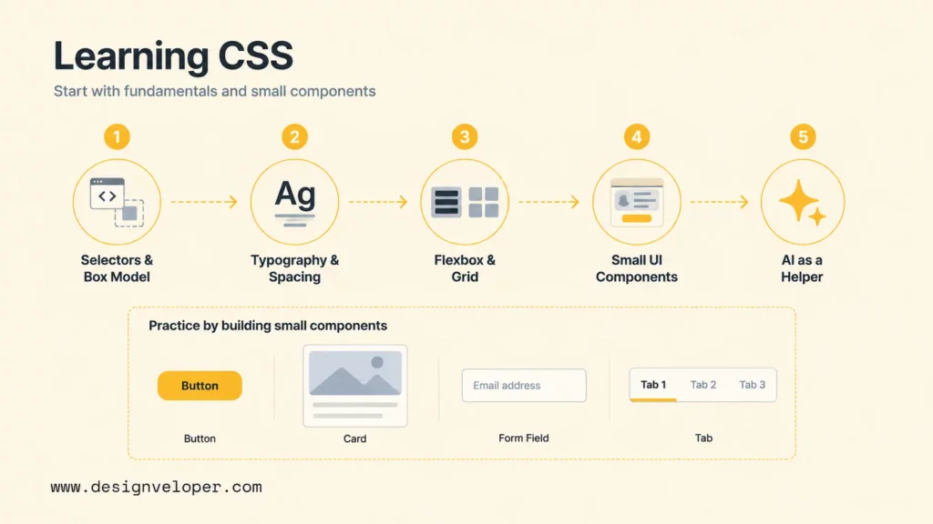
Beginners should learn CSS by building small, visible interfaces and inspecting how styles affect real HTML. The fastest path is not memorizing every property. The fastest path is understanding selectors, the box model, typography, flexbox, grid, responsive design, and the cascade well enough to debug mistakes.
Learn Selectors, Box Model, And Typography First
Start with selectors, the box model, and typography because those ideas appear in nearly every CSS task. The box model explains content, padding, border, and margin. Typography explains readable text. Selectors explain how the browser knows which elements to style.
MDN’s What is CSS lesson is a good first stop because it introduces CSS as a practical styling layer for web pages. After that, build small examples: a profile card, a blog excerpt, a button group, a form field, and a navigation list.
Practice Layout With Flexbox And Grid
Practice layout with flexbox and grid after basic selectors and spacing feel comfortable. Flexbox helps align items in one direction. Grid helps build two-dimensional structures. Both methods are essential for responsive interfaces.
A good beginner exercise is to build the same card list three ways: a single-column mobile list, a flexbox row that wraps, and a grid layout with responsive columns. The exercise teaches why layout is not only about screen size; layout is about content, available space, and alignment rules.
Build Small UI Components Before Larger Pages
Small components teach CSS faster than large pages because each component has a clear purpose. Build buttons, alerts, cards, tabs, accordions, forms, headers, footers, and empty states before building a full landing page. Each component should include normal, hover, focus, disabled, error, and loading states where relevant.
Component practice also teaches maintainability. A beginner can learn why a reusable class is better than scattered inline styles, why design tokens prevent random colors, and why naming matters when a project grows.
Use AI As A Helper, Not A Substitute For Fundamentals
AI can help beginners learn CSS by explaining selectors, suggesting exercises, generating examples, and debugging visible issues. AI should not replace fundamentals because a beginner still needs to understand why a layout breaks and how to verify a fix.
A healthy AI learning workflow is simple: ask the AI for a small example, type the code yourself, change one property at a time, inspect the result, and explain the behavior back in your own words. That loop builds skill instead of only producing output.
How CSS Still Shapes Better Interfaces In The Age Of AI
CSS still shapes better interfaces because users experience software through layout, readability, motion, state, and responsiveness. AI can generate code, but users judge the final product by whether the interface is clear, accessible, fast, and trustworthy. CSS remains one of the main tools for turning product intent into a polished user experience.
For product teams, CSS quality connects directly to business quality. A dashboard with poor spacing makes data harder to scan. A checkout form with weak focus states creates friction. A mobile layout with overflowing content reduces trust. A design system with inconsistent CSS slows every future feature.
Production CSS also affects engineering speed. A clear style system helps developers ship new components without debating every color, breakpoint, or spacing choice again. A messy style system creates regressions because small changes in one area unexpectedly affect another page. That is why mature teams treat CSS review, responsive testing, and design-system governance as part of product delivery.
Designveloper treats CSS as part of product engineering, not as a cosmetic layer at the end. Our web application development services and UI/UX design services connect design systems, front-end architecture, responsive implementation, testing, and maintainability. When teams add AI CSS generators or AI-assisted front-end workflows, we still review accessibility, browser behavior, code quality, and long-term ownership.
That is where AI CSS tools fit best. AI can accelerate snippets, prototypes, and explanations. Human front-end judgment keeps the interface useful, accessible, maintainable, and aligned with the product’s real users.
FAQs About CSS
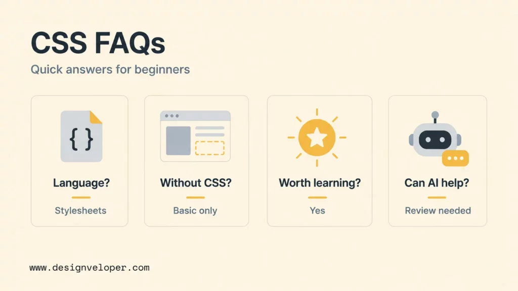
The questions below cover the common decisions beginners and product teams face when learning CSS or adding AI CSS tools to a front-end workflow.
Is CSS A Programming Language Or A Stylesheet Language?
CSS is a stylesheet language, not a general-purpose programming language. CSS describes how structured documents should look and respond visually. Modern CSS has powerful features such as variables, calculations, container queries, and animations, but its main job is presentation rather than application logic.
Can You Build A Website Without CSS?
You can build a basic HTML website without CSS, but the website will look plain and will have limited layout, branding, responsive design, and interaction states. Most professional websites need CSS because users expect readable typography, clear spacing, accessible states, and responsive layouts.
Is CSS Still Worth Learning In A Framework-First World?
CSS is still worth learning because frameworks and component libraries still generate or rely on CSS. Tailwind CSS, Bootstrap, Material UI, CSS Modules, styled-components, and design systems all depend on CSS concepts. Developers who understand CSS debug layouts faster and use frameworks with better judgment.
Can AI Generate CSS For Websites?
AI can generate CSS for websites, especially for snippets, prototypes, components, and layout suggestions. AI-generated CSS should be reviewed for accessibility, responsiveness, browser support, design-system alignment, and maintainability before production use.
What Should Beginners Learn First After Basic CSS?
After basic CSS, beginners should learn responsive design, flexbox, grid, accessibility-focused styling, browser developer tools, design tokens, and component-based CSS organization. Building small UI components and debugging them across screen sizes is the best next step.

